Should a company change its logo on a regular basis? Some globally renowned companies have not followed this path. They have trademarks with timeless appeal. Famous examples of these are the Coca-Cola logo script from 1887 and the Mercedes star from 1909. But thanks to today’s abundance of Internet images, it is clear to see that even such classics continue to change in nuance in order to maintain their graphic appeal. Elements become thicker or thinner, or shading comes and goes.
On the other hand, there are also examples where a radical new logo has triggered a major boost in modernisation. In Germany, a prominent example of this is the rebranding of the ARD television broadcaster, when it switched from an old-fashioned blue radio-wave oval in 1984 to a modern “One” with a glossy computer look, which was years ahead of its time.

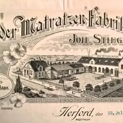
Stiegelmeyer has always combined the best of both approaches. There were long decades of great constancy, but also the courage to set out in a new aesthetic direction, if necessary. Right from the beginning, after its foundation, the company had graphic ambitions. Although the early letterheads from 1902 did not include a logo, the “Herforder Matratzen-Fabrik” lettering was given the form of a dynamic wave, with a suggestion of lightness and dynamism. The message was clear: at Stiegelmeyer, things are on the up and up!
This sense of lightness did not last for long, however. During the 1900s, the first real logo was created, and it leaned more towards the gravity and weightiness of Wilhelminian taste. The basic shape was a black hexagon with one elongated point that now pointed downwards. The JSt&Co (short for the company name at the time: Joh. Stiegelmeyer & Co.) lettering, on the other hand, took the shape of a wave above a diamond. In the middle of the diamond was a black circle adorned with a metal bed. The graphic designer positioned the & symbol symmetrically in the logo, which meant that the text actually read as “JS&tCo”.

On the positive side, this logo looked like a prestigious quality seal, and it reflected the heavy materials that were used in the beds and wire mesh mattresses in those days. The composition was rather sombre and convoluted, however, and the abbreviation served more to obscure the company name than promote it.
Hence, this first logo was only used from around 1910 to 1925, and was replaced in the roaring twenties by a completely different grand design. Lightness and dynamism were reintroduced. The Stiegelmeyer name now soared steeply upwards as a dynamic script – now using a “Latin” cursive script. This is notable, since hardly anyone wrote in this style in the days of the Sütterlin script. Here, Stiegelmeyer was sending out a message of modernity and internationality. The wide, sweeping loops of the letters and the underscore that flows from the last “r” suggest that the legendary Coca-Cola script was already influencing the typographic trends of the day.

This new logo was the hallmark of the company for 75 years and was used very flexibly over the decades, with many variants. In its basic form, the script was black on a white background and was enclosed in a black oval. The script was often used on its own, however, and sometimes, unexpectedly, in bold colours. In the 1930s, it glowed in orange on raspberry red, and in 1970, with the introduction of the colourful “Series 70” hospital beds, it appeared in white on a pink flower.
Looking back on this today, it seems quite odd that this logo was dropped in 2000, despite having long since achieved the status of a timeless classic. And yet, there were plausible grounds for this. The playful, nostalgic script was no longer felt to be compatible with the increasingly high-tech nature of the products. As early as 1989, the old logo was “shrunk” and used in combination with “Stiegelmeyer” written in a modern wide typeface – which resulted, somewhat unconvincingly, in the Stiegelmeyer name appearing twice in the logo.

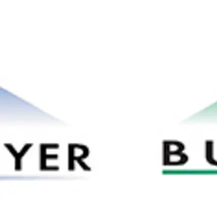
The 100-year celebrations and the launch of the company’s first website in 2000 therefore provided the impetus to create a completely new design. The blue Stiegelmeyer triangle celebrated its debut. Like a direction arrow, it pointed upwards above the company name and symbolised, even better than the previous ascending script, the company’s will to progress. For the first time, there was also a special green version for Burmeier, the up-and-coming young brand for homecare.

Indeed, it was mainly due to printing difficulties that these triangle logos were replaced by new versions just four years later. Also, with the commercial success of the home computer around the year 2000, experimenting with graphic design became very popular. Everyone was fascinated with “Word Art” and Photoshop. The first triangle design reflected this: the triangle itself and even the underline below the company name had a “fade to transparent” fill. This means that the colour becomes ever paler in one direction until the geometric form itself dissolves. The result is a wonderfully light and airy visual effect. In theory.
In practice, however, in the year 2000, this concept was still too much of a challenge for day-to-day media production. In PDF brochures from this period, the beautifully designed logo looks stratified and stripey. The printing costs hit the ceiling. Also, colour gradients quickly fell out of fashion – and are actually still unfashionable today.

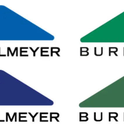
For these reasons, the blue and green triangles were soon revamped, in 2004, and given their current, timelessly elegant form. Now, the colours were solid, the lettering returned to a more classic look, and the underline was dropped for greater clarity. The pointed corners were rounded, heralding, to a certain extent, the style of the fast-approaching app era.
These logos fulfil their purpose perfectly, from day to day and from near and far. Even in the form of a small icon on a handset, the distinctive triangle makes it easy to recognise a bed as a Stiegelmeyer or Burmeier model, even from a distance. In 2014, the blue and green became a little darker, increasing the contrast even more. The logos in this form still serve the company today, to everyone’s satisfaction.

End of story? Not quite. Because, in the summer of 2022, an additional logo was introduced at our company sites. The “Group logo” brings together the blue and green triangles for the first time. It symbolises the size, the diversity and the solidarity of the Stiegelmeyer Group as a whole: its ability to develop comprehensive solutions that transcend the boundaries between sectors and products. The English name “Stiegelmeyer Group” also highlights the company’s increasingly international outlook. Where the previous individual logos are still predominantly used in sales, the Group logo embodies a global umbrella brand for the strong Stiegelmeyer and Burmeier brands, particularly in corporate communications.
Will this logo family now become a classic, too? Or will future developments in graphics awaken a desire to try something new? Whatever happens: our successors are bound to have a few things to report on at the 250-year celebrations.


